Try incognito/private window as well. Known to help some. Not sure which extension disagrees with smartly, but wouldn’t be the first time I saw it. Glad you got it sorted.
weird. nope on reboot the copy button is still not working after reboot to copy the stuff back… running same latest version of chrome on both machines.
Is one a different OS or something? Try clearing cache/browsing history on the offending one?
But is there a way to maintain the customized colors/grid gaps etc etc etc? THe biggest issue I see to alter the names using the webtool for Smartly is that: I loose everything I did 
That’s why I gave you the code (better code below). You can change names without the tool, using CSS code.
Preaching to the choir, I hear yeah. We will get pro back someday  (which allows what you are asking for), but that day is not today I fear
Right now? Not really, Sorta kinda, but not really.
Only if you set everything in CSS. Here is some of mine incase you want to use it. These set background color and icon colors, so that smartly does not ‘clobber’ them. I’m not sure how to set the grid/rounded corners or other stuff that gets ‘clobbered’, but I find those items are easily fixed with a few clicks.
.tile.garage-control.open {
background-color: rgba(33,100,223,0.9) !important;
}
.tile.blub,
.tile.switch .material-icons{
color:rgba(0,0,0,.65) !important;
}
.tile.switch .tile-title:after {
color:rgba(0,0,0,.65) !important;
}
If you list out what other items you need, I could try to help. I too want Pro back (clobbers my living background gifs, stupid bubbly rounded edges, and other things that urk me), but I understand @spelcheck is supper busy with “more important” items ATM.
UPDATE ON TITLE REPLACMENT
I stole this from @markus on ‘the other site’
.tile-title::after {
    visibility: visible;
    position: absolute;
    text-align: center;
    left: inherit;
    right: 0;
    bottom: 0;
    white-space: pre-wrap;
}

#tile-33 .tile-title, #tile-50 .tile-title {
    visibility: hidden;
    white-space: nowrap !important;
    overflow: unset;
}
#tile-33 .tile-title:after {
    content: 'Lights - Guest Bath Basin';
}
#tile-50 .tile-title:after {
    content: 'Lights - Guest Bath Basin';
}
If you want to set the title of ALL tiles, just hide all like this first:
.tile-title {
    visibility: hidden;
    white-space: nowrap !important;
    overflow: unset;
}
or just multiple:
#tile-33 .tile-title, #tile-50 .tile-title, #tile-16 .tile-title {
    visibility: hidden;
    white-space: nowrap !important;
    overflow: unset;
}
This MAY not be pixel perfect on mobile devices, you could try “left: 0;” instead of “left: inherit;”
Hi all.
I was trying a new style today and was playing around with the date attribute.
Is there no style attributes for this?
I’m wondering if this is the correct support page for smartly. Is this one current or should it be in hubitat forum?
Throw me a bone 
To my understanding this is the ONLY support page for smartly since all mention of smartly in any meaningful way was removed from Hubitat’s community.
Your in the right place. Check here for all things smartly. Let us know if you need any assistance.
Sorry I missed this. Weather is getting too dang nice, so I neglected my PC time.
There is no styling for the “Date” attribute, but that’s a great reason to make some!
What would you like to see done to the “Date” attribute tile? It looks like the month/day/year are separate, so we should me able to adjust thing fairly easily. Let me know your thoughts and I’ll see what can be done.
HI TechMeax.
I did not expect a super quick response from developers, I thought maybe someone could just point me in the right direction.
It’s been over a year since I used smartly and decided to revamp my dashboards (that a testimony to how good the product is)
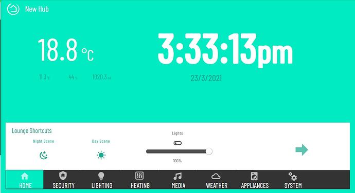
This is a sketch of the early mockup I have created.
As you can see I have a date/time attribute under the clock which is cropped. Ideally I would like a date attribute that could have the colour changes and what parts can be displayed. I.e day, month
The default has this wacky way of displaying it which is not ideal.
Anyway also would love to hear more input.
Edit: I don’t suppose there is anyway to get rid of the second hand from the clock is there. I have a feeling I know the answer but thought I would check ![]()
So that’s the Date-Clock attribute (not “Date”) which does have a few mods. Unfortunately I don’t think much more can be done with it. However, while appreciate the consideration, I’m not a dev, and I’ll have to tag @spelcheck for confirmation. That tile seems to be pulling system time, and there doesn’t seem to be any separation of anything, meaning we cannot manipulate anything.
Just spit balling here, but we might have better luck using a “custom app” to pull the data from a time server and configure it to have a better output attribute. Not being a dev I don’t know how to do that, or if it is possible.
I’m using the date/time and time tile in this design. However would like to see the date tile customisable as you suggested whilst using the time tile additionally.
You have had your fair share of input into this for a while, okay you may not be coding, but you are one of the core developers - I’m sure @spelcheck thinks that too 
@spelcheck just noticed something that I think is a bug.
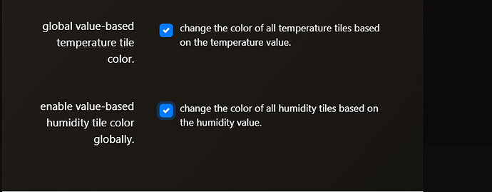
When you select these.
and you save.
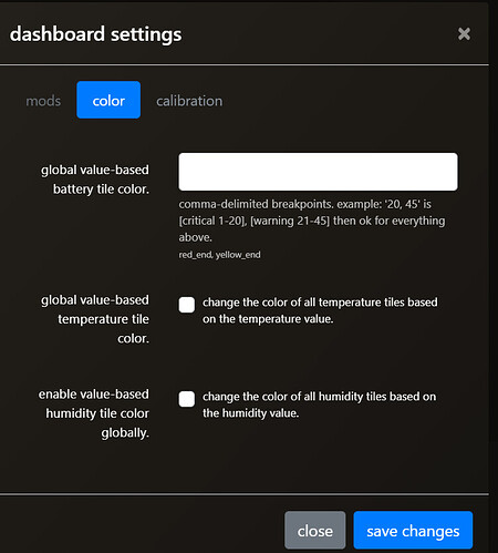
every time you go back in you have to tick the box again as it doesn’t save.
Thanks for reporting this @BorrisTheCat. I just tested and I see what you mean. The check boxes on the smartly editor are un-checked when going back. However the setting does seem to stick, meaning the color changes are still applied, even if you do NOT recheck the boxes.
Can you please confirm this is what you are seeing as well, and I’ll get a bug report going.
I wanted to circle back with you on this. While admittedly I’ve been spending too much time Egg Hunting I did spend some time messing with this. The one thing I’m hung up on is how to get all the div’s combined. I might need some expert help from @spelcheck on this one. His mojo is much more powerful than mine.
Here are the class you can traget and some of the ‘hacking’ I’ve done thus far.
#tile-2 .month.p-1 {
 background : #fff !important;
 color: #b11;
 font-size: 100%;
 text-align : left;
 padding-left : 25px;
}

#tile-2 .weekday.p-1 {
display:none !important;
}

#tile-2 .day.p-1 {
 color: #b11;
 font-size: 75%;
 text-align : center;
 padding-left : 0px;
}

#tile-2 .year.p-1 {
 color: #000 ;
 font-size: 100%;
 text-align : right;
 padding-left : 0px;
}
I think the div’s need to be combined via HTML changes, but that’s above my pay grade.
I did start a github request for it, since we have no mods, and we should.
A search did not find an answer to this.
I need to move the smartly-inject tile on my dashboard, but am not sure how to select the tile as it is always hidden.
It is overtop of a menu tile and the smartly-inject tile is not hidden on my older iPad.
You’ll need to manually remove it from your JSON (Layout tab) and then add it back where you want it.
To do so, look for this entry on the layout tab (recommend c/p into Notepad and then search for “javascript” to locate it)
    {
      "rowSpan": 2,
      "template": "attribute",
      "col": 3,
      "colSpan": 2,
      "id": 1,
      "row": 1,
      "device": "1256",
      "templateExtra": "javascript"
    },
Make sure to remove the “{” all the way to the closing “},”
Once removed c/p the remaining data back into the layout tab and save. Then add smartly inject back as you normally would.
Each
“device”: “417”
should only be in the file once correct?


