Created a ticket to track this, will tag you when we get it working. Thank you again for your help with the troubleshooting! 
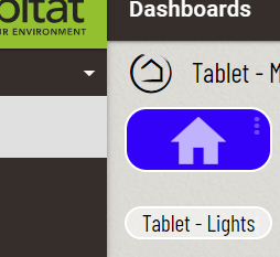
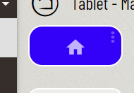
When using the icon for the dashboard link instead of the text, I have to enter a custom label or the icon seems to be 2-3 times bigger than normal.
Without Label:

With Label:

Are you using a single space character as the title in that second screenshot? It isn’t a bad thing to have the icon nudged to the left a little bit, and it will look centered between the left edge and the three dots.
I usually want to create more mods to make adjustments like this, but the mods will get pretty confusing if I add another ‘remove label’. Let me know about the blank/space title. I’m hoping that can work!
I will try with the blank space tomorrow. It works fine if I put a custom title in there. It just makes it big if I remove the label and don’t put a custom title in there, even if I mark it not to show.
This might be the wrong forum to post in, but I’m really curious to know how you guys do the color differences based on attribute value. I have a screentime counter I built for my kids and I would love it if it would change color, size, etc. based on the value of screentime remaining.
If you could repost into the release thread [RELEASE] smartly 2.1.0 featuring smartly-inject that would be great. I think it’s a good idea!
Please include a screenshot of what the tile looks like that you’re using, and any other information you can. Having the tile background color change on time remaining would be great at a glance. ![]()
Posted it in the other forum. Thanks.
yes, exactly. the reason I haven’t added this to the advanced/basic conversion thread is because it is only a revert… it shouldn’t be used for any other reason than you converted from basic to advanced and want it reverted.
if you, let’s say, converted then adjusted a few tiles to be 1 click smaller, then the 911 process would calculate the tile to be a decimal and it would probably shift those tiles to the left and potentially confuse HE.
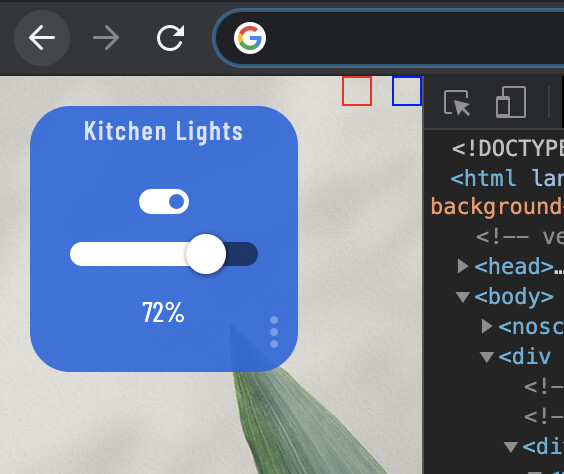
Hi @spelcheck, is there a simple way to add a tile to a dashboard when the header is hidden? Right now I copy/paste into Smartly, enable the header, copy/paste back into my DB, add the tile(s), copy/paste back into Smartly, do the normal edits and then copy/paste back into the final DB. Thanks!
You could add this CSS to create a touch area for the add tile button. Blue box is the settings touch area, red box would be the tile add touch area. The borders are only to show the touch areas in this screenshot, they are actually hidden.

.dashboard div .header>.flex-auto.justify-end>span:nth-child(2) {
    color: transparent;
    display: inline-block;
    height: 15px;
    position: absolute;
    right: 25px;
    top: 0;
    width: 15px;
    z-index: 99999;
}
I’ll give that a try, thanks!
I added that in but the only item that appeared was the green ‘onlne’ icon. I tried looking at the page source code to see what you’re doing to see if I could fix it myself but, alas, I failed. I’m not strong on CSS/Json (PLCs are my bailiwick) and I got lost when I tried to identify the nth-child so that must be something more experienced people understand. Any suggestions? Thanks.
Let’s have you try nth-child(3)…
.dashboard div .header>.flex-auto.justify-end>span:nth-child(3) {
    color: transparent;
    display: inline-block;
    height: 15px;
    position: absolute;
    right: 25px;
    top: 0;
    width: 15px;
    z-index: 99999;
}
I think I got it but it just wasn’t changing to ‘3’… I tried many things so it wouldn’t just be a ‘it didn’t work’ reply.
- Changing to 3 didn’t show anything different.
- I tried a 1 and a 4 just to see what happened and only the green checkmark ever showed.
- I tried a different background, no difference.
- I changed from transparent to white and noticed that the ‘+’ appeared but it got obscured by the bear claw.
- I changed the right value to 250px and the ‘+’ moved in and was then selectable.
edit - oh, for clarity, it was ‘3’ that showed the ‘+’.
At this point there’s a working solution, so please don’t spend anymore time on it, I know you’re busy and appreciate the help. The only thing that didn’t ‘work’ as you described is that it’s still a ‘+’ instead of a block which is no biggie as it gets enabled very infrequently.
Thanks again.
Thanks for the reminder, my side project took more time than I expected this weekend. I’ll get these post over here, and updated this week for sure. I’ll also post some of the “Basic to Advanced” grid post too.
Sorry to post here but I can’t seem to create a new post and I can’t reply to anything in the lounge. Is there a time based permission to post in the Lounge?
tagging @RRodman 
@stephack it makes sense you might not be able to post new topics, but not sure about Lounge. Is it only the Lounge where you can’t reply?
Yeah… looks like it’s only the Lounge. Coincidentally, the only place I want to post at the moment 
Edit: @spelcheck @RRodman, all good now.
No problem either way. The Dashboard still works and looks like it always has on the old iPad. This iPad is just used in my office for Hubitat dashboards and Ring Doorbell Cam alerts and video.