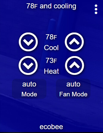
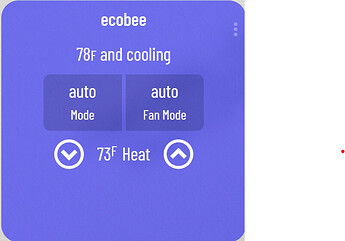
Can you help @RRodman?
This is on a fire tablet. Fire HD 10 (9th Gen)
Didn’t think to try on my galaxy tab ill try to recreate on the galaxy and see if it does it there too.
It didn’t do it on the galaxy tab but one thing that i did notice is that the smartly invisible tile is right where those 2 tiles are. could it be that? i cant seem to be able to get the smartly tab and move it.
The injection tile won’t interfere with the layout at all. This is strictly a CSS bug, which I hope I’ll be able to recreate. If you could, PM me your JSON and I’ll take a look!
Sent you a message with the json. tried sending as a txt file but it wouldn’t let me.
I remember @techmedx had a thread on HE community that covered this. I’ll see if I can find it and maybe we should recreate it here. It covered using transparent tiles, altering IDs to bring the tiles “forward” and stacking them. NOTE: once you stack tiles, they are abruptly moved to open space when/if using our drag and drop feature.
reposted here HE Dashboard Tile Stacking
@spelcheck thanks for that; very helpful! It would be great if the ability to overlay could be handled through the drag and drop capability you built…
yeah I feel you! sadly that’s a limitation of gridstack.js, which handles the actual drag and drop functionality.
when enabling drag and drop mode while having stacked tiles, it will predictably move those stacked tiles to the bottom of the screen, so theoretically you should be able to correct those using the built-in HE manual click placement to get them back to their original positions. IMMC it moves the “top” tiles out of the way.
I hope this helps!
Thanks for this great app and sad to see you’re no longer on HE forums.
I just installed smartly and it looks great. I’ve been working on converting my phone’s dashboard. I use a Samsung S20+ and my wife uses a Samsung S20. We share the same dashboard. As such, I typically leave the “column width” blank so it can fit both our screens.
The issue I have is that for some reason, leaving the “column width” blank makes it scroll a tiny bit to the right (instead of being static). I have 3 columns and they should fit both our screens perfectly. Please any idea on how to fix this? It works fine with my original dashboard.
Another issue I have is with text. For some reason, most of the tile edits work on texts. I tried making it central but the text isn’t centralized. However, changing the color does work. Please any help there would be appreciated.
Finally, using the dimmer mod, when the dimmers are on, it’s hard to see the dimmer level. Any way I can change it to make it a bit more visible? A little bit more white would be great.
Tried to upload a screenshot but the site won’t allow me to.
Thanks!
Oh, I should probably also mention that even when I select calibration (samsung galaxy s20+), the column width remains at 60 which results in only 2.5 columns showing (instead of 3). It’s only when I change it to about 50 or 51 that it looks fine on my screen.
From whatismyviewport, my DPIs are as follows
412px x 831px
Screen Size: 412px x 915px.
Thanks
First, happy to have you here!
You should leave the default column width alone and instead use the calibration feature. You’ll add both phones to the calibration and it’ll adjust the screen perfectly for each phone, no adjustments needed! Set your column back to what it was. It was either 135 width x 60 height, or 60 width x 22 height.
I’ll have to see screenshots to know what you mean, but I’d be happy to help! I’m going to tag @RRodman to maybe just bump up your trust level so you can do that now. Keep in touch about the other things and I’m hoping you’ll be able to post images this week ![]()
I suggest using the “stock percentage” theme of the dimmer mod. that’ll give you a white percentage text to the right and will only show the blue designed text when you touch/drag.
Thank you… Not sure why the calibration isn’t working for me then. On my Samsung Galaxy S20+ and with the calibration for S20+ selected, it’s only showing 2.5 columns so I have to scroll a bit to the right to see everything on 1 screen. I’m trying to avoid having to scroll horizontally.
Also, there’s no Samsung Galaxy S20 listed under calibration. My wife’s screen DPI settings are:
360 x 670px
360 x 800px
Thanks
Those dimensions don’t quite make sense to me, as when portrait, it might be 360px wide but should turn into like 320px when landscape because of the address bar.
Can you navigate to whatismyviewport.com on both the S20 and the S20+ and post dimensions for both landscape and portrait? You’ll need to note both values, then rotate the phone for the next set. I have the S20+ in smartly as 384x780. Thanks for the help!
TIL whatismyviewport now shows the full screen dimensions ![]() rotating the phone to get other values isn’t necessary anymore.
rotating the phone to get other values isn’t necessary anymore.
apologies I missed this reply… please try “Generic 411-413px” and see if it works for your phone as portrait. for the S20 try “Generic 359-361px” for now until I get them both in the system.
Thank you! Using the generic the dashboard scrolling issue. However, it brought another issue. For the dimmers (both using the slider and the mod), my clicks are no longer accurate. They are skewed to the right. So as an example, if I click around the 50% level of a dimmer, it now corresponds to about 23%. Please any idea why that’s happening? Clicking the 3 dots works fine for both the dimmer tile and other tiles. Turning it off at the bottom left also works just fine.
Thanks
Ha! Unfortunately, the forum doesn’t allow me PM directly to you or send links yet. So I’m pasting it using spaces.
Thanks
https:// pastebin. com/yw0tReWJ
I just tried on another of my dashboards (my wall mounted Fire HD 10 tablet using Fully Kiosk) and the same issue is occurring. but this time, it’s skewed in the opposite direction (so a click around the 23% level corresponds to 100% brightness). Screen size works great on that (using the Fire HD 10 configuration).
Sorry about my various issues tonight and thanks for looking into this!
This is a fairly significant bug you found… I’m really surprised it hasn’t come up before.
Some technical background, we use CSS zoom/-moz-scale-transform to “calibrate” the screen to allow to x # of rows widthwise. transform: scale() works the same. the issue is the jquery-ui slider baked into HE doesn’t account for zoom/scale/transform so it is reacting to the original mouse position.
Something else I missed earlier… On my ecobee thermostat, I use “Auto” mode. This mode has a separate setpoint for both heating and cooling. The regular HE dashboard has always displayed this well and you can change each of those setpoints separately.

With smartly, it only shows me the heating setpoint.
Please would you be able to make it show both setpoints?
