|DEPRECATED - Now included with SMARTLY! Follow the NEW instructions here: [smartly] BASIC 135/60 to ADVANCED 60/22 grid conversion instructions - #3 by spelcheck
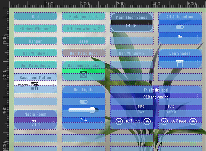
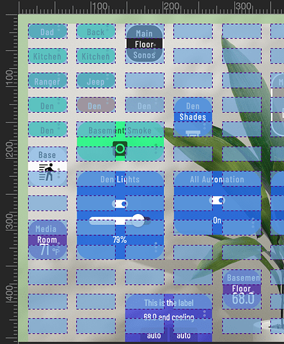
Now that SMARTLY-INJECT enables drag-and-drop, we created a process to automatically convert your grid to ADVANCED (aka ‘quarter height/half width’)
Below is the OP on the subject that you might be interested in.
‘quarter height’ tiles in smartly
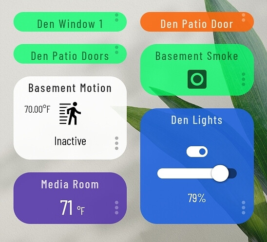
HALF HEIGHT - Stock smartly row height is 60px. We call this ‘half-height’ because at 1x height, it will show a one line title, the icon, and a secondary value like battery or temperature. When you set a tile to 2x height, it makes a square. Two halves make a whole.
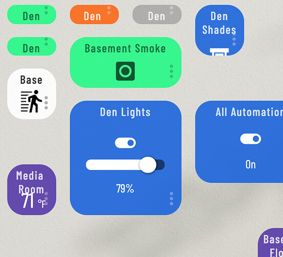
QUARTER HEIGHT - Setting row height to 22px will make your 1x height tiles ‘quarter-height’… showing just the title. You’ll then have to make those tiles 2x height to bring them back to the size of a smartly stock ‘half height’ tile. Two quarters make a half.
THE ORIGINAL SMARTLY 3/4 HEIGHT - With your row height set at quarter-height, you now have the option of setting a tile to be 3x height, which will make them the OG smartly 3/4 height. And, based on that math, 4x height will make them a square.
Also, when using ‘quarter-height’ row height, the 1x height ‘title-only’ could still be useful, as it still shows the device name and the status color.
HEIGHT OVERVIEW
When using ‘quarter-height’ row height in smartly (22px):
- 1x height is ‘title-only’, showing the device name and the status color.
- 2x height is great for anything where it only requires an icon (requires a single line short/shortened title).
- 3x height is great for anything you’d like to also show the status text for under the icon (or just to be rad AF).
- 4x height is for anything with a slider or otherwise requires a full height tile.


![]()

