The current “touch (stock percentage)” dimmer mod style should position the actual switch icon lower down and might be what you’re looking for. It looks like you’ve got one of the OG manual css patch. Let’s have you run your JSON through smartly and if it doesn’t look right, there might be some of that leftover CSS in your Custom CSS 
2 Likes
It looks like the injector was removed from the page preventing the % from flipping from one side to the other.
2 Likes
Oh yes, that little trick is only possible when smartly-inject is active. Good troubleshooting!
1 Like
It would be great to be able to revers colors for contact sensors. I have a dashboard that is set up to alert me by making some large tiles change to red. Most doors and windows are primarily grey but when they are open the tile turns red. I have one door that I need to stay open and would like for it to be grey when open and then Red when closed.
1 Like
You can do this via the CSS exposed by the smartly inject. Change the ‘xyz’ to your target tile
#tile-xyz.open {background-color:grey !important;}
#tile-xyz.closed {background-color:red !important;}
1 Like
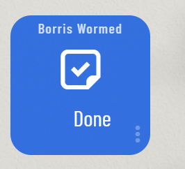
Is it possible to change the ON from a switch to X and OFF to Y?
Use case I have a few virtual switches that turn on when the cat needs worming and flea treatment. I have changed the icons for ON and OFF but you still get the ON and OFF words. So it would be great if ON could be changed to needs doing and OFF is done or something like that.
@BorrisTheCat Try this and let me know how it goes. Change tile number as needed)
#tile-123 .tile-primary>div {
	visibility : hidden ;
    right : 9px !important;
}

#tile-123 .tile-primary.on>div:after {
        visibility : visible !important;
        content : 'Words for ON' !important;
}

#tile-123 .tile-primary.off>div:after {
        visibility : visible !important;
        content :' Words for OFF' !important;
}
I’m planning to make a smartly CSS “tips and tricks” thread. LMK if it works for ya, and I’ll be sure to include this one when we do.
3 Likes
Ah yes. My bad. That is because when we “hide” the value it is still there consuming space, we just cannot see it.
added this to the above. (edited above for completeness)
right : 9px !important;
Adjust the number to compensate.
“On/Off” only differ by one character, so hopefully that is with-in OCD limitations.
I know there is a “better way” to do this, but it’s beyond my CSS skill level. I stole some of this from Markus’s old post here. If you can translate that better to the CSS path above, I’d happily take an update. (if not the above will work ![]() )
)
3 Likes
@TechMedX @BorisTheCat
Here’s what I used - this also accounted for font size, & color
#tile-123 .tile-primary>div {
    visibility: hidden;
	position: relative;
}
#tile-123 .tile-primary>div:after {
    position: absolute;
	left:0;
	width: 100%;
	visibility: visible !important;
	font-size: 1rem;
}


#tile-123 .tile-primary.on>div:after {
    content: 'Words for ON';
    color: #27ae60;
}

#tile-123 .tile-primary.off>div:after {
    content : 'Words for OFF';
    color: #e74c3c;
}
Cheers! This thread gave me a big shortcut, as I’m new to customizing my HE Dashboard
4 Likes
It would be awesome if Smartly did not revert some of the items back to defaults like,
Templates, grid, spacing… or there is an option to not revert those or keep what you already had when you past those items over.
3 Likes
We’ve had ways to work around it in the past, but since 2.0+ I haven’t yet reworked it. I see us having a better way of doing it soon, and I know @techmedx would agree it’s needed! I’ll create a issue for it so we can track it
1 Like
…rounded edges, smaller icons, I hear ya! 
TBH I hold off updates until I have enough to justify the pain, bring back ‘pro’!
Easter egg??? Then again if you been around @spelcheck long you might know his definition of “soon” is slightly different then Webster’s
1 Like
We’re rubbing off on him.

2 Likes
hahaha you guys!  but in all seriousness, pro should come back and wouldn’t be too much work
2 Likes
I have a few issues. Not sure if I should post here or make a new post.
I paste the CSS into the site, make some changes, put the code into Hubitat. I’ve done that a few times to tweak a few things and every time I do, the number of columns and rows the dashboard is using increases. Some tiles are 12 columns wide and 16 rows tall now. It’s not a huge deal I guess… but it gets annoying because when I post the CSS back into Hubitat I have to change column width and row height back to blank so it auto fits. And because the Smartly inject is an invisible tile on the dashboard, I have to reduce the number of columns the dashboard is using by however many columns that icon takes up. Right now the entire dashboard is 24 columns (not including the ones used by smartly) and 44 rows because of this.
My second issue is that even though I used the “calibrate my dashboard” option and selected Pixel 2, the dashboard still scrolls up and down slightly. Even if there are no tiles right at the bottom of the screen and even if I reduce the number of rows in the dashboard. I am still messing around with the sizing and groupings of the tiles, but here are 2 screenshots illustrating what I’m talking about. You can see in the 2nd one that the names of the tiles are cut off because it let me scroll down just a little.
It seems to scroll by about the same height as the header, so I thought I’d try using the “hidden” header theme, but it didn’t change anything. The scrolling is also present in the web browser.
EDIT: Apparently I can’t include images or links in my post.
1 Like
This is a known issue. when smartly see’s blank row/columns it converts you to advanced grid settings 60/22. I’ll double check and make sure it is written up for tracking.
Are you using Dashboard tiles on the bottom? If so they are half height and can create the issue.
My iPad does this as well, only up and down not left to right. To ‘fix’ it I use this code in CSS
.dashboard .wrapper {
    overflow: hidden;
}
This is a discord trust level issues since your new to the site (welcome). It helps prevent spam. Check out a couple threads and the site will quickly upgrade your account level.
1 Like
This fixed the scrolling issue.
2 Likes