So I have been using InfluxDB and Grafana to provide some history and data graphing for upwards of 6+ months now and it has been great so far. But one issue seems to keep popping up: when a data point is not available at the start of the time range, regardless of the fill type, there is a gap in the output graphic. I think it is due to the very nature of IoT devices being logged into a database on a irregular basis but I was hoping someone had experienced this and maybe thought up a workaround.
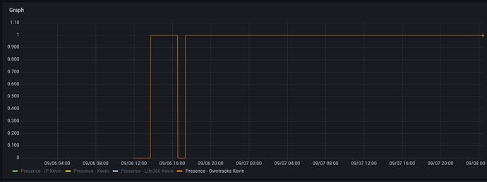
Example past 48h:
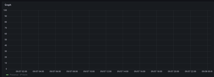
Example past 24h:
Notice that there has been no change for that particular metric for the past 24 hours (from the 48h graph), so when only looking at the past 24h there is “no data” to reference, even though it is not that there is “no data” but rather that the data has not changed.
Also note that even for the 48h graph, there is a bunch of data missing at the start because the data had not changed until before the time range started.
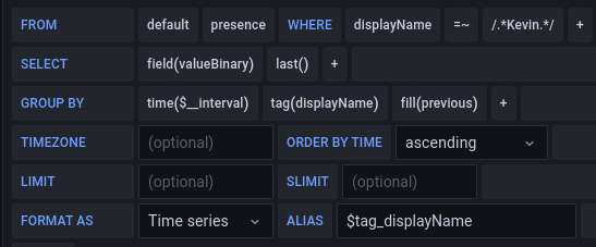
Both of these graphs were generated using this query:
After researching a bit online, some places say just to push data into the DB on a regular interval, regardless of when it changes. But this seems to be a very bad solution that doesn’t really solve the problem but rather just hides it, at the cost of efficiency and database size. I also found issues on the GitHub’s of both InfluxDB and Grafana that reference an issue like this, but both of them are quite old (5+ years), and still have gone unresolved despite seeming overwhelming community calls for it.
If anyone has any ideas on a way to fix this I would very much appreciate it.
