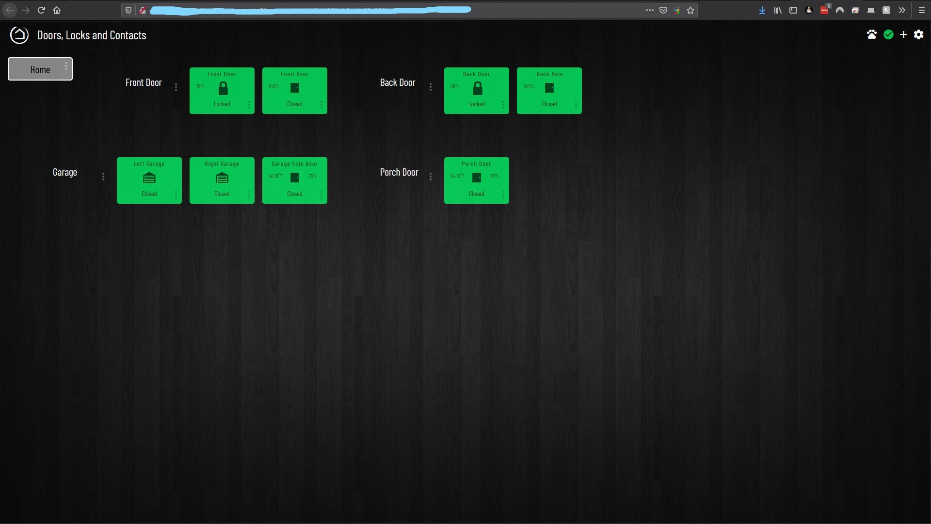
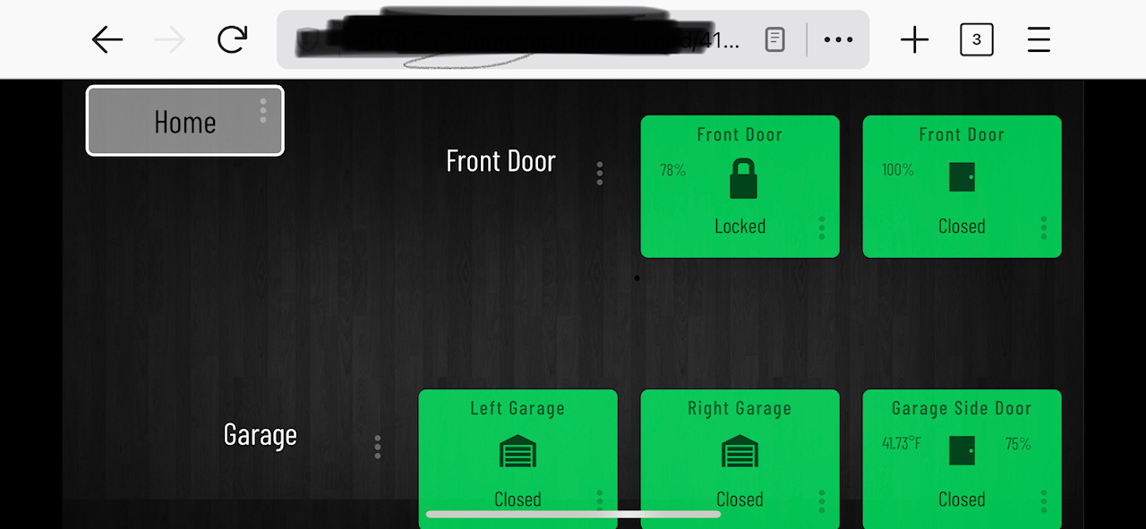
So I’m trying to understand how this works with the dashboards. I set up my dashboards on a monitor. Under each dashboard, I have chosen iPhone X and iPad Pro as my devices. Going to the iPhone or iPad, I still have to scroll to the right to see everything, whereas on my monitor, it is all on one screen. Do I need to setup my dashboards so they are only a few columns wide but go down on the screen instead of fitting it all on my monitor screen? Or am I looking at this all wrong?
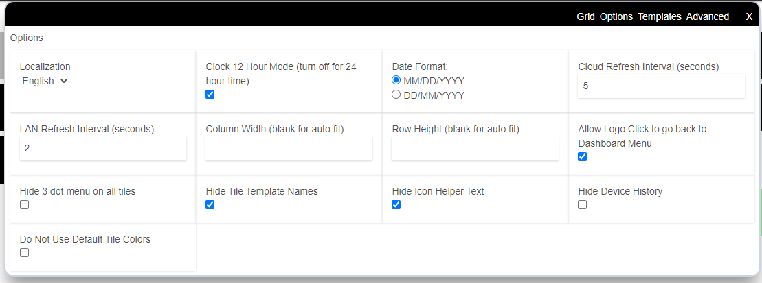
yes, essentially you do have to take the device in to consideration. Usually mobile is around 5 columns depending on what size tiles you use. There is also an option to auto fit under options. Might help you to figure out your pallet more easily.
Each devices has it’s own screen size, so some dashes may need to be “custom” for a given device.
I use 3 columns with larger tiles for my cell dashes. I am usually rushing to look or trigger something, so I find slightly larger tiles help. At home I use smaller tiles for the my iPad when I’m generally not in as much a rush.